
We recently framed this Paul Kratter painting for a couple in Washington State, and I wanted to share one aspect in particular that we're emphasizing more and more. It's what Walter Crane, the first president of the Arts and Crafts Exhibition Society called "mural feeling" - the effect of a framed easel painting framed and hung to feel like a part of the wall. As Crane wrote, "The easel picture, properly considered and placed in its right relationship to its surroundings, by judicious treatment and hanging, and above all by a certain mural feeling, may be the acme of decoration. It’s relation to a scheme of decoration may be like that of a jewel in a dress." Two keys to achieving this effect are demonstrated by this piece: first, and more obviously, the very architectural feeling of the mortise-and-tenon frame; and second, the hanging system which allows the frame to hang right up against the wall with no gap, and especially importantly, without leaning forward and down the way pictures usually do when hung with a wire. The way we do this is to cut recesses on the back (the "reverse," in framer's parlance) of the frame and attach d-rings in the recesses. There's no wire; the picture hooks are carefully located on the wall so the d-rings hang directly off the hooks. With the d-rings and the picture hooks both in the recesses there's nothing to push the picture and frame away from the wall.
What's so important about this is the effect of unity and the aim of restoring the primal unity of all the arts, but in particular the most divided arts historically speaking, which are painting and architecture.
One other thing about this frame that I particularly like is the

flush through tenons, shown here:




 In late February I spent a couple of days at Silver Lake just south of Lake Tahoe. A recent storm left a fresh layer of snow and cooler temperatures. I had a chance to do some sketching (I'll write about that later) and did one painting.

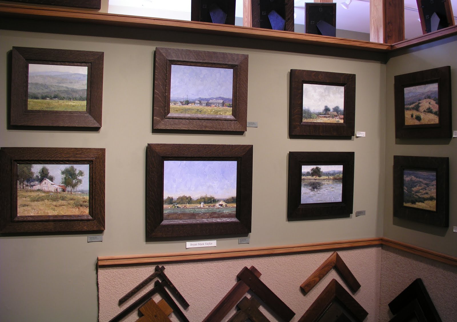
 Made another big step in this year's plan to grow the theme of the picture gallery as contemporary paintings of the local and northern California landscape: Sacramento painter Terry Miura recently delivered his first batch of paintings. They are a real privilege to have here, and I look forward to framing them and displaying them. Terry, who's a friend of Paul Kratter, is also a graduate of the Art Center in Pasadena and has a professional commercial art background, having worked in New York as a freelance illustrator for magazines and newspapers. Originally from San Diego, while in the Big Apple his paintings naturally focused on cityscapes, but now he's delving into the rural landscapes of his native state. He's got a wonderful tonalist palette, reflecting his gentle vision of rustic California as well as a humbler approach to the role of painting as just one of the arts that create an architectural interior.
 Of all the woods we use, we tend to emphasize quartersawn white oak. But walnut has always been a big favorite too, especially for carving. In preparing for the Paul Kratter show in June, the painting we decided to use for the publicity suggested walnut. Here's a corner detail of the frame, which is a compound design, meaning it's composed of more than one molding. This one has a cap molding as well as a liner. The liner has pale gold leaf laid directly on the walnut so the grain comes through.


 flush through tenons, shown here:


 Posts


