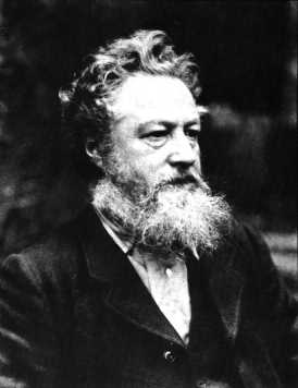
Friday, December 23, 2011

Provide: The motto of business in the new economy

As the year winds up, I thought I'd write about another aspect of what we're trying to do at Holton Studio—about our greater mission and purpose as a business. Because with the economy in a shambles, I believe it's time businesses think in a fundamentally new way—which is actually an old way, as you'll see—about what business is for.

Wednesday, November 16, 2011

Re-framing Thaddeus Welch

Thaddeus Welch (1844-1919) was one of the great historic California landscape painters. This classic bucolic hillside scene by Welch came in recently, the customer looking to free it from a typical period compo frame which he rightly judged to be pretentious and unsuitable to the rustic spirit of the painting.
Before
Here it is in its new quartersawn white oak frame in a dark stain matching the shadows and sympathetic with the forms of the hills, with simple fine beading to pick up the delicate line work in the painting (especially the trees)—and much more suitable to the spirit of nature that so moved Welch.
After

Wednesday, November 2, 2011

Re-framing a Sydney Yard Watercolor

A follow-up to the last entry, here's a wonderful example of a watercolor by one of California's premiere early watercolorists, Sydney Janis Yard (1855-1909). This is a frame we've used before, for other, similar California watercolors — by Percy Grey — but this job offers the re-framing aspect to the story.
Before
The "before" shot demonstrates the typical conventional contemporary framing approach for this type of piece. The silk mat and curly-cue gold frame seem intended for nothing but projecting an air of sophistication around the painting. The glaring white mat contrasts so much with the deep shadowy tones of the painting that it actually interferes with the eye's ability to adjust to the light the artist captures so effectively. In so doing, it spoils the painting. The incongruous framing not only fails to serve the painting itself, but creates a harsh divide between the painting and its surroundings. The gold frame may not look too bad in the photo above, but is a production compo molding nailed together. One corner was already broken. The frame didn't hold up to scrutiny — or to life (see detail below)!
Corner of old frame

What the painting needed instead was a dark frame, quiet and soft in profile, with just a halo of gold to highlight it on the wall while continuing and sustaining the spirit of the picture into the architectural realm.
After
Titled "Under the Oaks," the painting's rustic spirit — completely ignored by the previous framing —  and of course the oak trees Yard painted called unquestionably for an oak frame. (The protective aspect of the oak frame is another level of meaning for a depiction of oak trees sheltering a shepherd.) This is a simple 2-3/4" wide scoop in our Century Series (No. 308.2) around a 3/4" ogee liner oil gilded with 23 kt leaf. We stained the scoop a burnt umber (our Medieval Oak stain) matching the shadows — the frame being a shadow effect around the painting, to draw your eye to the lighter painting. Two fine reeds at the sight edge of the dark molding echo some of the fine details in the painting. A closer view of the frame:
No. 308.2 ("Michigan") — 2-3/4" with 3/4" gilt oak ogee liner

Taking the time to craft the frame well with splined closed corners (finished after joining) and attention to finishing off every detail actually has an aesthetic effect, a sense of caring made tangible, not conveyed by digital photos.

The piece is framed archivally by using a hidden, or "gasket," mat under the liner. It's purpose is to separate the picture from the glazing (in this case u.v.-filtering acrylic). The rabbet is lined with a metal tape to isolate the acids in the wood from the watercolor paper.

Thank you to Montgomery Gallery, where this beautiful painting is available.

Wednesday, October 12, 2011

Framing Historic California Watercolors

We've recently had the pleasure of framing several watercolors by notable California artists working in the early twentieth century.

Maynard Dixon (1875-1946):

Chris Jorgensen (1838-1876):

William S. Rice (1873-1963):

Marjorie Stevens (1902-1992; available through North Point Gallery):

Lorenzo Latimer (1857-1941; these available through North Point Gallery):

Davis Schwartz (1879-1969):

Tuesday, October 11, 2011

Sharon Calahan Medals in OPA Western Regional!

Sharon Calahan came home from the Oil Painters of America Western Regional Exhibition this weekend with a Bronze Medal! Her painting is "June Pasture," 20" x 40". We had framed it in a quartersawn white oak compound flat with carved sight edge.

Congratulations, Sharon!

Wednesday, September 7, 2011

A Chamfered Mirror

John Ruskin wrote, "to those who love Architecture, the life and accent of the hand are everything."

One age-old kind of handwork is chamfering, and its application to frames is one of the greatest joys in my work.

This is a quartersawn white oak mirror I just made for a customer to give as a wedding gift. It measures 34" x 22", and features a carved initial "S" at the top and the year at the bottom.

Here's the story, with pictures, of its making.

Saturday, August 27, 2011

Real Wealth: Steve Jobs and Handcraft

Steve Jobs and handcraft are not two things we naturally associate with each other. But they should be. Allow me to explain.

Wednesday, August 17, 2011

James McGrew

We're excited to be welcoming James McGrew to the Gallery.
 A passionate explorer and painter of Yosemite National Park, James has spent a lifetime (well, his life so far) capturing the Park's magnificent natural beauty. We're featuring his plein air work, all fairly small (i.e., nicely affordable). While we're still framing his paintings, you can see what we have pre-framed on his page on our site, here. (His own website is here.)

We're also framing a beautiful piece, below, for James to enter in the American Impressionist Society's Annual Show in October in Carmel.

Great to have you aboard, James!

Tuesday, August 9, 2011

Framing a Pamela Glasscock Watercolor

We just framed a set of three floral watercolors by northern California artist Pamela Glasscock. To marry the delicate images with a Craftsman interior, we couldn't do better than our old standby, the Yoshida frame. Made in machiche, a tropical hardwood (sustainably harvested) from Belize, which we chose for its natural color which harmonizes perfectly with the paintings. The frame's joined with tiny through mortise-and-tenon joints with raised square plugs at the corners.

One reason I wanted to show this here is because it contrasts with the heavier frames we use on the oil paintings I tend to blog about. Also, we haven't framed close here, so it's a chance to show we don't always frame close. Instead, the paper, which has nice deckled edges, is floated. Floating can come off as pretentious—a way of separating the picture from the frame and surroundings. In other words, it often has a stand-offish effect. In this case, though, it simply treats the paper as a three-dimensional object. A watercolor of this delicacy is never going to be integrated architecturally—achieving what's sometimes called "mural feeling." So in this case, the separation effect of floating makes sense.

Pamela Glasscock is represented by Calabi Gallery, in Petaluma, CA and I. Wolk Galleries. A wonderful watercolorist!

Saturday, August 6, 2011

Re-framing Hanson Puthuff

The landscape paintings of Hanson Puthoff (1875-1972) made a major contribution to California's rich heritage of landscape painting. Unfortunately, his pieces did not always find their way into frames that do them justice. Here's one example we had the honor of re-framing this week, taking it out of a machine-made, gold painted compo setting and putting it in a handcrafted, carved quartersawn oak frame. Here it is before and after:
 A well-made, simple home. A 3" bevel profile (canvas is 11-1/2" x 15") with a 45 degree carved chamfer sight edge. Close-ups:

Here's a profile view of the frame:

Tuesday, August 2, 2011

Re-framing a New—and Much Larger—Rosa Bonheur

Last year we re-framed a couple of paintings of stags, both by premiere nineteenth century French wildlife painter Rosa Bonheur, which I blogged about here. We just did another one, and at 48" x 36" it's considerably bigger than the first two. First, here it is in the compo exhibition frame that we were to replace:

And here it is now:

Given the log house setting it's going in, our solution leans more to the rustic than it might have considering the highly formal (I generally use the term in reference to form, not sophistication and refinement) treatment of the subject matter. But having the frame come out of the same appreciation of the beauty of nature and handcraft that the painting does—especially in contrast to the original frame—more than makes up for whatever formal refinement we left out of the profile. (For a more formal profile on a similar painting, see the earlier entry on re-framing Bonheur stags, here.) I stand by it as a far more sympathetic setting than was the old frame, and far more successful at the primary job of a frame, which is to help us see the picture. Any rejection of pretentiousness and false luxury in art is a step in the right direction! Taking a picture from an exhibitionist presentation to one in harmony and sympathy with the picture is fulfilling one of my favorite William Morris phrases: "for beauty's sake and not for show."

This is a compound frame with a mortise-and-tenon flat, a carved cap-molding and carved and gilt liner. After that wonderful reward of the framer—the moment when you finish fitting the picture and turn over the completed piece to see it—Trevor and I were struck by how the highlights were enhanced. Is it the gilt liner, the darker frame, or the combination? Beyond that, I can't add anything that I didn't say in the previous Bonheur re-framing example.

Here's a corner detail:


Trevor Davis gets credit for making it. Here's the proud craftsman—giving you a sense of the scale of the piece, too.

Saturday, July 30, 2011

Congratulations Bryan Taylor!

Our artist, Bryan Mark Taylor, won first place in the Quick Draw competition at Plein Air Easton, Maryland (July 18-24, 2011). Congratulations, Bryan! Learn more here...
See the piece and the artists remarks on it at his blog, here.

Here are a couple of my favorite pieces we have by Bryan:
"Morro Rock Memories," o/c, 9 x 12.

"Along Adobe Road," o/c, 8" x 10".
See Bryan's page on our website here.

Thursday, July 28, 2011

Recent Bill Cone work, and framing

Bill Cone recently brought in these two beautiful pastels for The Summer Show.
"Gateway Morning," pastel on paper. 8" x 8".
"Wildflowers," pastel on paper. 9" x 12".

We've also just completed framing a few of Bill's works for a customer. Here they are:


All are profiles that are simple but designed to suit Bill's direct and no nonsense views of the natural landscape. They're done in carved walnut, muted with a light stain, which is just right with the artist's palette and texture.

Bill's blog is always fascinating. Top notch!

Thursday, July 21, 2011

The Arts and "Reverence for Life"

A new entry for the quotes on the page, "Re-framing Art"


William Morris
"It is indeed in...the belief in the beneficent progress of civilisation, that I venture to face you and to entreat you to strive to enter into the real meaning of the arts, which are surely the expression of reverence for nature, and the crown of nature, the life of man upon the earth." —William Morris

The idea of "reverence for life", famously credited to Albert Schweitzer, reverberates through the twentieth century, inspiring ethicists, philanthropists and environmentalists (Rachel Carson dedicated Silent Spring to Schweitzer). The concept came to Schweitzer as the culmination of a deep personal moral struggle in 1915, and would inform and infuse his great humanitarian career as doctor and pastor over the next 50 years—a career acknowledged in 1952 by a Nobel Peace Prize.

Albert Schweitzer
But it's never been fully appreciated that well before Schweitzer's epiphany—in 1880, when Schweitzer was just 5 years old—William Morris articulated the ideal in the words above (in his lecture "The Prospects Of Architecture In Civilisation").

Monday, March 28, 2011

"Als Ik Kan": Hephaestus's Imperfect Frame

A new entry for the quotes on the page, "Re-framing Art":
"Als Ik Kan"


William Morris "Si Je Puis" tile from Red House

If the Arts and Crafts Movement can be said to have a motto, it is surely "Als Ik Kan." First assumed by William Morris—more famously in its French form, "Si Je Puis"—it was further popularized by Gustav Stickley through the marks on his furniture and in his magazine The Craftsman. What does the motto mean, where did it originate, and why did these re-framers of art find it so significant?

Wednesday, February 9, 2011

"Kevin Courter: From Dusk to Dawn" is posted

The last of Kevin Courter's paintings for his upcoming show, "From Dusk to Dawn," is in, and it's a great example of a theme he's been having a lot of fun with for the last few months. This is called "Evening's Solitude," and it's 8 x 16. The frame, No. 1.4 CV, is one we use often, as it's so versatile, simple and effective.

Hope you'll put the show on your calendar. It opens Saturday, February 26, with a reception for the artist from 4 to 6 in the evening.

Tuesday, February 1, 2011

Reframing Art: "All true art is praise"

The first entry for the quotes on the page, Re-framing Art:

"All true art is praise." 

John Ruskin's statement is among his most quoted and is takes us right to a central motive for why painters paint—a motive that fundamentally shapes our idea of art and its place and role in our lives. Art holds up to us things we admire, love, and find praise-worthy.

Framing J Bond Francisco


Recently framed this John Bond Francisco , designing the setting to echo playfully with the massive green frame at the center of the painting. This little oil, 12" x 8", depicts the artist's San Francisco studio around the turn of the century. The frame profile's a No. 16—a plain flat mitered frame with a chamfered (45 degree bevel) sight edge. Chose a flat profile to go with the relatively shallow depth of field and flat object—the painting—that's the focus of the piece. But the angles and design of the stove suggested the chamfer. A bit wider than I normally would've used on a piece this size, but in keeping with the proportions of the depicted frame on its painting. Going as green as the frame in the painting would have sacrificed the harmony of painting and frame, but rubbed green paint in to the grain of the oak to resonate with the frame in the picture.The liner is oak with gold leaf. All is simple as the room depicted—simple, but fun!

Framing Ludmilla Welch

We've had the privilege of framing more and more historical work, and this past month got to re-frame this sweet oil painting, "Foggy Morning," (10" x 17") by Ludmilla Welch, who with her husband Thaddeus Welch, worked in San Francisco at the turn of the century. It's in a very low slope Century Series 3" wide profile in stained quartersawn white oak.

Monday, January 10, 2011

True Grit: See us on the big screen!

Early last year I got to brag here that we'd gotten a call from the set designers for the Coen Brothers remake of the classic western, True Grit. Well, as you're probably aware, the film is out and doing gangbusters at the box office. If you look closely, you'll see our frames (the oak ones—NOT the gold ones, of course) in the courthouse scenes near the beginning, in which Rooster Cogburn and Mattie Ross first meet up.