Friday, August 13, 2010

Framing Kevin Courter's "Cradled Moon"

Enjoyed framing this 12" x 14" oil for Kevin Courter, now at New Masters Gallery in Carmel. Chose walnut for its color (used a light stain to get the harmony just right) and because it's good for carving. Chose a flat profile, since it's a flat composition, but at the sight edge it's got a very subtle convex, or ovolo, form echoing the form of the treetops cradling the moon. The frame similarly cradles the painting. The carved pattern takes its cue from the crescent moon and the branches. The narrow slip with lemon gold leaf matches the moon.

Thursday, August 12, 2010

Framing Kevin Courter's "Soaring Skies"

Just finished framing this wonderful Kevin Courter oil on linen, 20" x 16", titled "Soaring Skies." I wanted the frame to extend the perspective with the right form and amount of line work, but keeping it simple and rustic in spirit. The color came out of the shadows in the grasses. Shadows are frequently a good source for frame color, helping the frame remain subordinate to the painting. The bright sunlight off the clouds suggested the gilt slip.

The painting is headed to New Masters Gallery in Carmel.

Saturday, August 7, 2010

From Gold to Oak—II: 19th Century British Still Life

This is another re-framing job that we did maybe a year ago. It's a still life, oil on canvas, by 19th century British painter Edward Ladell (1821-1886). Here's how it was framed when it came in:
 
And how it looked after we re-framed it in stained quartersawn white oak to be more in sympathy with its rustic spirit:

Here's the profile, fairly flat over all, but refined and with beads all keyed to the highly formal and finely drawn painting:


Monday, June 28, 2010

From Gold to Oak—I: Re-Framing Rosa Bonheur Stags

Have you ever looked at a painting and realized that you were fighting to see past the frame, that the frame was actually inhibiting you from seeing the painting? Maybe you've held your hands up to one eye and used them to block out the frame. That was very much my reaction—and I suspect the reaction of the customer who brought it to me—when I first laid eyes on this sweet little oil by the great French painter Rosa Bonheur. The elaborate, swirly gold frame was so imperious, showy and unsympathetic to everything about the picture—the subject, palette, line work, forms and, above all, the rustic spirit—that it actually felt laborious to really study and appreciate the painting itself. (The owner was also seeking a frame that would be more suitable to the painting's destination in a log home.) At just a little over 8" x 6", it was being eaten alive by some past owner's or dealer's insecurities (it didn't help that a makeshift gold colored liner had been used to make the painting fit a 10" x 8" frame). The poor creature appears inexplicably displaced to some Parisian bank manager's parlor, and seems to stare at us as if to say, "What the heck am I doing here?"

Relief finally came when I removed the work from its setting and could enjoy this stately fellow that Mademoiselle Bonheur had distinguished so skillfully. Seeing past the significance of the painting and refusing to be awed by the signature in order to appreciate the work itself, I could craft no better solution than this plain and simple 2-5/8" wide flattened scoop with a single bead at the sight edge. At last, we can see the painting without effort, and the stag is in his natural habitat, warily watching us as intruders of his home.

A larger Bonheur of similar subject matter came in about a year later, with a similarly overbearing frame. Damaged in transit, the composition—or "compo"—breaking off demonstrates the dubious
 service of frames like this as protectors of paintings, not to mention the debased character of compo as fake carving. At 22" x 18", this canvas called for a larger and stronger frame, although with the same approach to line and form which we'd taken with framing the earlier painting.

The suitably rustic spirit of the quartersawn white oak frame molded to harmonize in line and form with this quiet but accomplished work, a dark stain to lead the eye to the lighter painting (the eye goes to light; frames are generally more successful when they're darker than the picture), and a touch of pale gold leaf on oak at the sight edge to echo the painting's contrasts and lend a note of honor to this noble beast all contribute to a setting that sustains and expands the spirit of this fine work and allows us at last to see and admire the painting.

Friday, June 25, 2010

Framing Photographs—I: Contemporary Landscapes by Geoffrey Agrons

Geoffrey Agrons is a good customer and a superb photographer. We just framed this set of his photos printed on handmade Japanese paper, and they present a good opportunity to demonstrate two important lessons of framing design: framing contemporary photographs close, and individualized frame design. Geoffrey sent seven photos, most of which are of the Cape May area during last winter's huge snow storm. (The large one here is of a woods in Ireland.)

For a slide show, with larger images, click here.

We decided to frame them all in walnut, a wood we frequently choose for photographs, first, because of the suitably native cool color—we used a black wash to better match the sepia ink color on most of them—and second, because of its tight grain and smooth texture, which is consistent with the smooth surface of photographs.

For the first image, above, I chose a slope for the overall profile since it was appropriate to the deep perspective as well as the slope of the ground and the angles formed by the roots. A cove terminating at the top with a fine bead made an ideal form to suit the trees and roots half-embedded in the earth.

What fascinated me in this image was the staccato rhythm of the line of fencing in contrasting with the soft forms of snow. So that's what I echoed in the frame, using fine 1/6" "quirks," or steps, and a soft cove at the sight edge. Here's a detail of the frame profile.

A flat profile was chosen for this picture because of the flat horizon. It's true that there is a deep perspective in this image, but the horizontal quality seems to be stronger. (If more of the stream could be seen meandering away toward the horizon, that might have swayed me to go with a slope.) A fine line, its 1/8" width in proportion to the sharp lines in the photos, was raised near the sight edge, and a gentle ovolo (convex form) at the sight edge to echo the banks of the stream and the snow.

This frame is a similar flat profile with a raised line, but with a cove at the sight edge. I love the way the grain of the walnut echoes the clouds.

This frame is a good example of the importance of line proportion because it's essentially a frame that's been an old standby for us, the Eastwood—a flat profile with a narrow step at the sight edge and a broader step at the back edge. But the line proportions formed by these steps had to be just right for this picture, since it's so simple, and those line proportions that have become standard for the Eastwood were too wide for this image, so we adapted them to suit this specific photo.

For this color photo, a slope was chosen to echo the angle of the snow. I used a carved panel just outside the sight edge to echo the sense of coarse texture.

Finally, for this extremely subtle image I used a profile with a suitably very subtle curve down at the sight edge. The frame's basically flat, but coves up toward the back edge with a quirk and a bead at the back edge, providing definition while also echoing the cylindrical form of the posts.

For more on framing photographs close, see my Picture Framing Magazine article (link to the pdf "Close Framed Photographs," in the right column of my page, "Further Reading," here).

Geoffrey will be showing these pieces and more this September at he New Jersey Audubon Nature Center in Goshen, NJ.

Again, click here to view these in a slide show (with larger views).

Wednesday, June 23, 2010

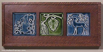
Framing Arts and Crafts Tiles

Suitable frames for tiles are hard to come by—especially as the old tiles in particular become more highly treasured: folks want to do them proud, but production frames on small works of real handcraft only accentuate their makeshift nature. Yes, tile frames are easy to overdo, and there's absolutely nothing wrong with a totally plain frame. But tiles are highly architectural, which makes them similar to paintings in being able to hold up to substantial frames. Having relief helps them in this respect as well. I want to show a few examples of what can be done with an exceptional tile that you might want to feature in your home with a frame that both protects and suitably honors it. It's also an opportunity to demonstrate what a single key design element can do for any piece of art.

This first piece, above, is a Grueby tile—a great and iconic Arts and Crafts piece familiar to many. At just 6" x 6" it wanted a restrained treatment. The fine line work suggested the two fine beads for the sight edge of the frame, while the cove (between the beads) provided a gentle means of focusing the eye on and taking the viewer in to the quiet mood of the piece.
The second example is another Grueby piece—an insignia tile in a diagonal format which offered an enjoyable challenge. We focused on the format of the of the piece to suggest an interesting design. This is two mitered frames with floating panels in the triangular spaces. I had fun using the ray flake to create kind of a sunburst effect.

The third example is a round trivet tile with a scene rendered in carved lines. Trevor expertly carved a line of the same size and shape (a small flute) just outside the circular window.

The series above is contemporary, made by Carreux de Nord out of Wisconsin. The wonderful line work in these needed only a complementary rectilinear treatment of the frame. A mortise-and-tenon flat was used for its architectural character and and to enhance the horizontal format of the tiles. This frame in particular could be hung to achieve great mural feeling. A mitered cap molding was chosen to contain and delineate the whole composition. What beautiful work these tile makers do!

Finally, another mortise-and-tenon frame we made years ago for a Rookwood Thistle tile. Again, the frame couldn't be simpler, except for the chamfer that amplifies the lines of the tile.

Of course, in all these examples, beautifully flaked quartersawn oak provides a great deal of interest as well as suitable material for Arts and Crafts items as well as the homes they're likely to reside in.

All these frames are flat, in keeping with the decorative flat treatment of the tiles, relying on just one element in the frame to echo a key element in the tile. But that's enough to achieve the frame's goal of sustaining and expanding the spirit of an artwork into the architectural realm and the life of the setting in which it will take its place.

View Tiles and Reliefs section of the Portfolio...

Monday, June 21, 2010

Framing Paintings—I: Kevin Courter's "Colusa Sunset"

"All true art is praise," as John Ruskin said, getting right at the heart of picture-making (and blowing the top off a lot of pretentious blather about art, too). Last fall Kevin Courter brought in this work of praise, a 16" x 20" oil on linen, less than 2 weeks before our show, "A Heaven in the Eye" was to open. It's a stunner, as you can see, and to a frame-maker an inspiration. My enthusiasm and the extra focus imposed by the deadline spurred me to produce one of my favorite recent pieces.

Saturday, June 19, 2010

An Embarrassment of Riches: New Showroom Display Full of Great Paintings

We just rehung the Gallery to show off all eight of our painters. It's a true delight to walk in and see such a lavish display of this tremendous group of artists.
I hope you'll come by and experience it!

Friday, June 18, 2010

"True Grit"

What's it take to get through a recession? A little "True Grit" helps.

The Coen brothers are remaking the John Wayne classic and needed authentic-looking quartersawn oak frames on several Matthew Brady portraits that will help dress up a courthouse scene. Left to right, that's Tim as William Wheeler, Trevor as Albert Pike, and Eric as Edmund Kirby-Smith.

Nice job, and it'll be really fun to see our work on the big screen! The flick reportedly opens Christmas Day.