Wednesday, June 23, 2010

Framing Arts and Crafts Tiles

Suitable frames for tiles are hard to come by—especially as the old tiles in particular become more highly treasured: folks want to do them proud, but production frames on small works of real handcraft only accentuate their makeshift nature. Yes, tile frames are easy to overdo, and there's absolutely nothing wrong with a totally plain frame. But tiles are highly architectural, which makes them similar to paintings in being able to hold up to substantial frames. Having relief helps them in this respect as well. I want to show a few examples of what can be done with an exceptional tile that you might want to feature in your home with a frame that both protects and suitably honors it. It's also an opportunity to demonstrate what a single key design element can do for any piece of art.

This first piece, above, is a Grueby tile—a great and iconic Arts and Crafts piece familiar to many. At just 6" x 6" it wanted a restrained treatment. The fine line work suggested the two fine beads for the sight edge of the frame, while the cove (between the beads) provided a gentle means of focusing the eye on and taking the viewer in to the quiet mood of the piece.
The second example is another Grueby piece—an insignia tile in a diagonal format which offered an enjoyable challenge. We focused on the format of the of the piece to suggest an interesting design. This is two mitered frames with floating panels in the triangular spaces. I had fun using the ray flake to create kind of a sunburst effect.

The third example is a round trivet tile with a scene rendered in carved lines. Trevor expertly carved a line of the same size and shape (a small flute) just outside the circular window.

The series above is contemporary, made by Carreux de Nord out of Wisconsin. The wonderful line work in these needed only a complementary rectilinear treatment of the frame. A mortise-and-tenon flat was used for its architectural character and and to enhance the horizontal format of the tiles. This frame in particular could be hung to achieve great mural feeling. A mitered cap molding was chosen to contain and delineate the whole composition. What beautiful work these tile makers do!

Finally, another mortise-and-tenon frame we made years ago for a Rookwood Thistle tile. Again, the frame couldn't be simpler, except for the chamfer that amplifies the lines of the tile.

Of course, in all these examples, beautifully flaked quartersawn oak provides a great deal of interest as well as suitable material for Arts and Crafts items as well as the homes they're likely to reside in.

All these frames are flat, in keeping with the decorative flat treatment of the tiles, relying on just one element in the frame to echo a key element in the tile. But that's enough to achieve the frame's goal of sustaining and expanding the spirit of an artwork into the architectural realm and the life of the setting in which it will take its place.

View Tiles and Reliefs section of the Portfolio...

Monday, June 21, 2010

Framing Paintings—I: Kevin Courter's "Colusa Sunset"

"All true art is praise," as John Ruskin said, getting right at the heart of picture-making (and blowing the top off a lot of pretentious blather about art, too). Last fall Kevin Courter brought in this work of praise, a 16" x 20" oil on linen, less than 2 weeks before our show, "A Heaven in the Eye" was to open. It's a stunner, as you can see, and to a frame-maker an inspiration. My enthusiasm and the extra focus imposed by the deadline spurred me to produce one of my favorite recent pieces.

Saturday, June 19, 2010

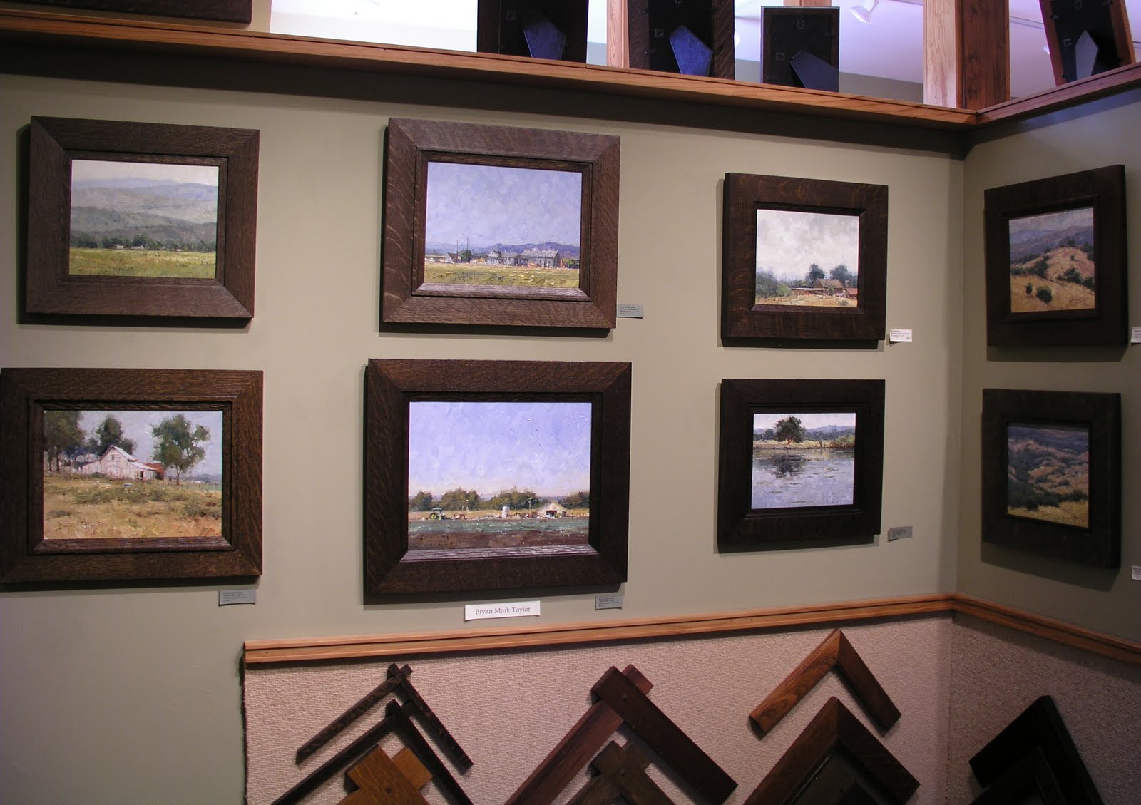
An Embarrassment of Riches: New Showroom Display Full of Great Paintings

We just rehung the Gallery to show off all eight of our painters. It's a true delight to walk in and see such a lavish display of this tremendous group of artists.
I hope you'll come by and experience it!

Friday, June 18, 2010

"True Grit"

What's it take to get through a recession? A little "True Grit" helps.

The Coen brothers are remaking the John Wayne classic and needed authentic-looking quartersawn oak frames on several Matthew Brady portraits that will help dress up a courthouse scene. Left to right, that's Tim as William Wheeler, Trevor as Albert Pike, and Eric as Edmund Kirby-Smith.

Nice job, and it'll be really fun to see our work on the big screen! The flick reportedly opens Christmas Day.

Tuesday, November 17, 2009

Holton Studio Landscape Show--A Heaven in the Eye


The opening for the current landscape show at Holton Studio, A Heaven in the Eye, took place last Saturday, Nov. 14th. The show features 7 Northern California landscape painters: Kevin Courter, Christin Coy, Mark Farina, Paul Kratter, Terry Miura, Robin Moore, Brian Mark Taylor. Tim Holton has assembled a strong show of landscape paintings, all beautifully framed in his Craftsman style frames, each one custom built to suite the painting it surrounds. The gallery is open daily and is located in Emeryville. Please visit the website for more information. http:/www.holtonframes.com

Tuesday, April 7, 2009

Cold Weather Painting, by Paul Kratter

In late February I spent a couple of days at Silver Lake just south of Lake Tahoe. A recent storm left a fresh layer of snow and cooler temperatures. I had a chance to do some sketching (I'll write about that later) and did one painting.
Winter painting offers some unique challenges, mainly staying warm. The obvious extremite to keep warm is your hands, but most of the time I'm able to paint glove-free. My feet always get cold standing in one spot and the freezing temperatures seem to slowly crawl up from my snow boots. Temperatures started at 18 degrees in the morning, but quickly rose as the sun warmed up the area.
Snow offers a unique color range from soft pinks to blues and purples. I saw this beautiful grove of pines standing out against the cool mountains in the background. The light and shadow patterns of the snow offset the strong graphic nature of the pines. I'm happy to sacrifice some cold feet in exchange for a chance to paint such a beautiful scene.

Thursday, April 2, 2009

Terry Miura

Made another big step in this year's plan to grow the theme of the picture gallery as contemporary paintings of the local and northern California landscape: Sacramento painter Terry Miura recently delivered his first batch of paintings. They are a real privilege to have here, and I look forward to framing them and displaying them. Terry, who's a friend of Paul Kratter, is also a graduate of the Art Center in Pasadena and has a professional commercial art background, having worked in New York as a freelance illustrator for magazines and newspapers. Originally from San Diego, while in the Big Apple his paintings naturally focused on cityscapes, but now he's delving into the rural landscapes of his native state. He's got a wonderful tonalist palette, reflecting his gentle vision of rustic California as well as a humbler approach to the role of painting as just one of the arts that create an architectural interior.
Terry will be included in the group show coming up next fall, "A Heaven In the Eye," in which he'll have new work capturing the Sacramento Delta. (Christin Coy, Paul Kratter, Kevin Courter and possibly another artist will join him.)