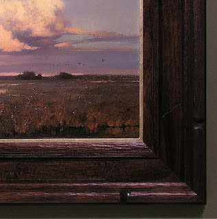
"All true art is praise," as John Ruskin said, getting right at the heart of picture-making (and blowing the top off a lot of pretentious blather about art, too). Last fall Kevin Courter brought in this work of praise, a 16" x 20" oil on linen, less than 2 weeks before our show, "A Heaven in the Eye" was to open. It's a stunner, as you can see, and to a frame-maker an inspiration. My enthusiasm and the extra focus imposed by the deadline spurred me to produce one of my favorite recent pieces.
Kevin says this is near Gray Lodge Wildlife Area off I-5 in Colusa County — a place I haven't been to but which a number of customers praised to the skies (how else to say it?) for the astonishingly huge flocks of geese and rare species to be seen there. It's a place where you can feel as though bird life is as strong as ever; as if life everlasting still means something (as it surely does, after all); as if we can still witness nature's eternal beauty (which we can). It's some place to praise.
Most of the framing we do is more restrained, simple, frank. But one thing a frame legitimately does is sustain and amplify the praise the picture has started, and this praise can be as lavish as you like, so long as the frame remains subordinate to the picture and obeys the first law of the universe: the law of help. Or, to borrow William Morris's words, "all this is not luxury, if it be done for beauty's sake, and not for show."
There's a very important distinction between this use of decorative treatment to enhance a painting and the illegitimate praise the frame has frequently been enlisted to lavish on, not the subject of the picture but the picture itself—the picture as trophy, as symbol of status and wealth. In this role the frame is often oddly blind to the character of the picture. Is a slick gold frame ever well-suited to a painting of a cow or a weather-beaten barn—or a muddy river bank? That's the frame as unflattering flatterer and sycophant, not as friendly home or accompanist.
The frame's praise of nature begins with suitable materials, and this was a beautiful piece of American Black walnut, with rich native color (a little stain was used to get the color harmony just right) and a bit of interest in the grain but still even and workable for carving. I chose walnut for the cool brown native color and the tight grain which is better for detailed carving. Also, our most frequently used wood, quartersawn oak, has strong figure that can compete with this more refined kind of carving.
It's hard to take frame designs to this level on smaller or more impressionistic or on tonally subdued paintings. But a work as strong as this one leaves room for the frame-maker to be more free. This piece was large enough, had enough tonal power, and was simply so reverential in spirit that it called for a more elaborate frame. It is also detailed and highly rendered enough to suggest more detail in the frame.
The key to having a frame be more elaborate without upstaging the painting is the harmony of the elements (line, form, material, color, texture) and economy in their use: every element and detail should have a reason for being—should be justified by the painting, and echo an element or detail in the painting. In other words, key to keeping the frame subordinate to the painting is having nothing in the frame that isn't a complement to, or echo of, something in picture. In this case, the primary form in the painting is the cloud. This frame's response to that form is obvious (the carved bead with rounded stops at the corners, the scallop stops on the flat). The amount and strength of line in the frame must be economical as well—constrained by what suits the painting. I had fun picking up the fine grasses in the foreground with fine carved lines at the frame's sight edge.
I don't expect to ever make another frame exactly like this, because there'll never be another painting exactly like this. That's one of the tests of a truly living art form: it's alive to the other arts—and to the world—-in specific ways. But it's not hard to do. It just requires taking the time to truly see and appreciate the adjacent arts. And it demands that we work with both freedom and humility in our service to the other arts.
It helps, too, to have inspiration, which in this case was provided by Kevin Courter and the landscape of Colusa County, California.
New Winter woods boxes
-
I am finishing a group of new Winter Woods boxes and working on a new book
proposal to replace my now 28 year old book *Creating Beautiful Boxes With
In...


No comments:
Post a Comment
Substantive comments & questions are welcome