Steve Jobs and handcraft are not two things we naturally associate with each other. But they should be. Allow me to explain.
Saturday, August 27, 2011
Wednesday, August 17, 2011
James McGrew
We're excited to be welcoming James McGrew to the Gallery.
 A passionate explorer and painter of Yosemite National Park, James has spent a lifetime (well, his life so far) capturing the Park's magnificent natural beauty. We're featuring his plein air work, all fairly small (i.e., nicely affordable). While we're still framing his paintings, you can see what we have pre-framed on his page on our site, here. (His own website is here.)
We're also framing a beautiful piece, below, for James to enter in the American Impressionist Society's Annual Show in October in Carmel.

Great to have you aboard, James!

We're also framing a beautiful piece, below, for James to enter in the American Impressionist Society's Annual Show in October in Carmel.

Great to have you aboard, James!
Tuesday, August 9, 2011
Framing a Pamela Glasscock Watercolor
We just framed a set of three floral watercolors by northern California artist Pamela Glasscock. To marry the delicate images with a Craftsman interior, we couldn't do better than our old standby, the Yoshida frame. Made in machiche, a tropical hardwood (sustainably harvested) from Belize, which we chose for its natural color which harmonizes perfectly with the paintings. The frame's joined with tiny through mortise-and-tenon joints with raised square plugs at the corners.

One reason I wanted to show this here is because it contrasts with the heavier frames we use on the oil paintings I tend to blog about. Also, we haven't framed close here, so it's a chance to show we don't always frame close. Instead, the paper, which has nice deckled edges, is floated. Floating can come off as pretentious—a way of separating the picture from the frame and surroundings. In other words, it often has a stand-offish effect. In this case, though, it simply treats the paper as a three-dimensional object. A watercolor of this delicacy is never going to be integrated architecturally—achieving what's sometimes called "mural feeling." So in this case, the separation effect of floating makes sense.
Pamela Glasscock is represented by Calabi Gallery, in Petaluma, CA and I. Wolk Galleries. A wonderful watercolorist!
Saturday, August 6, 2011
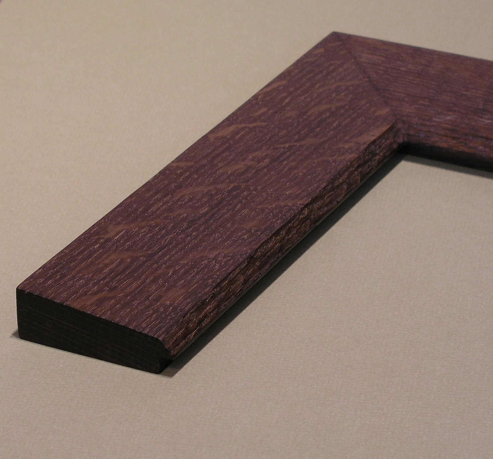
Re-framing Hanson Puthuff
The landscape paintings of Hanson Puthoff (1875-1972) made a major contribution to California's rich heritage of landscape painting. Unfortunately, his pieces did not always find their way into frames that do them justice. Here's one example we had the honor of re-framing this week, taking it out of a machine-made, gold painted compo setting and putting it in a handcrafted, carved quartersawn oak frame. Here it is before and after:


 Here's a profile view of the frame:


A well-made, simple home. A 3" bevel profile (canvas is 11-1/2" x 15") with a 45 degree carved chamfer sight edge. Close-ups:


Tuesday, August 2, 2011
Re-framing a New—and Much Larger—Rosa Bonheur
Last year we re-framed a couple of paintings of stags, both by premiere nineteenth century French wildlife painter Rosa Bonheur, which I blogged about here. We just did another one, and at 48" x 36" it's considerably bigger than the first two. First, here it is in the compo exhibition frame that we were to replace:

And here it is now:

Given the log house setting it's going in, our solution leans more to the rustic than it might have considering the highly formal (I generally use the term in reference to form, not sophistication and refinement) treatment of the subject matter. But having the frame come out of the same appreciation of the beauty of nature and handcraft that the painting does—especially in contrast to the original frame—more than makes up for whatever formal refinement we left out of the profile. (For a more formal profile on a similar painting, see the earlier entry on re-framing Bonheur stags, here.) I stand by it as a far more sympathetic setting than was the old frame, and far more successful at the primary job of a frame, which is to help us see the picture. Any rejection of pretentiousness and false luxury in art is a step in the right direction! Taking a picture from an exhibitionist presentation to one in harmony and sympathy with the picture is fulfilling one of my favorite William Morris phrases: "for beauty's sake and not for show."
This is a compound frame with a mortise-and-tenon flat, a carved cap-molding and carved and gilt liner. After that wonderful reward of the framer—the moment when you finish fitting the picture and turn over the completed piece to see it—Trevor and I were struck by how the highlights were enhanced. Is it the gilt liner, the darker frame, or the combination? Beyond that, I can't add anything that I didn't say in the previous Bonheur re-framing example.
Here's a corner detail:

 Trevor Davis gets credit for making it. Here's the proud craftsman—giving you a sense of the scale of the piece, too.
Subscribe to:
Posts (Atom)